i: about my famicase exhibition
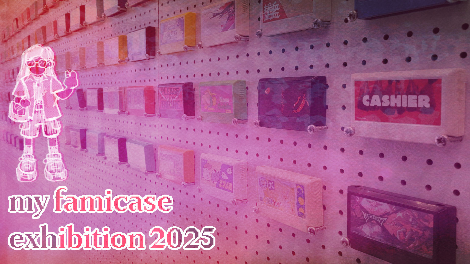
My Famicase Exhibition is an annual exhibition that originated in 2005 from METEOR, a gallery & retro-games shop based in Tokyo, Japan. Entries for the exhibition aim to design and create a label for an imaginary Famicom game cartridge.
This year marks the exhibition's 21st anniversary, and I had the pleasure of having an entry in the exhibition. I’m quite honored because there’s so many entries across the globe and I was insanely ecstatic when I got the email that I was able to get in. I’m making this blog post since this past weekend got to see my entry at andand gallery - a local gallery here in L.A. that was hosting the exhibition.
Thank you to the team at METEOR for organizing and putting together this exhibition! special shoutout to Satoshi for who I was in contact with for submitting my entry, getting pictures from the exhibition, and purchasing this year's exhibition catalog.
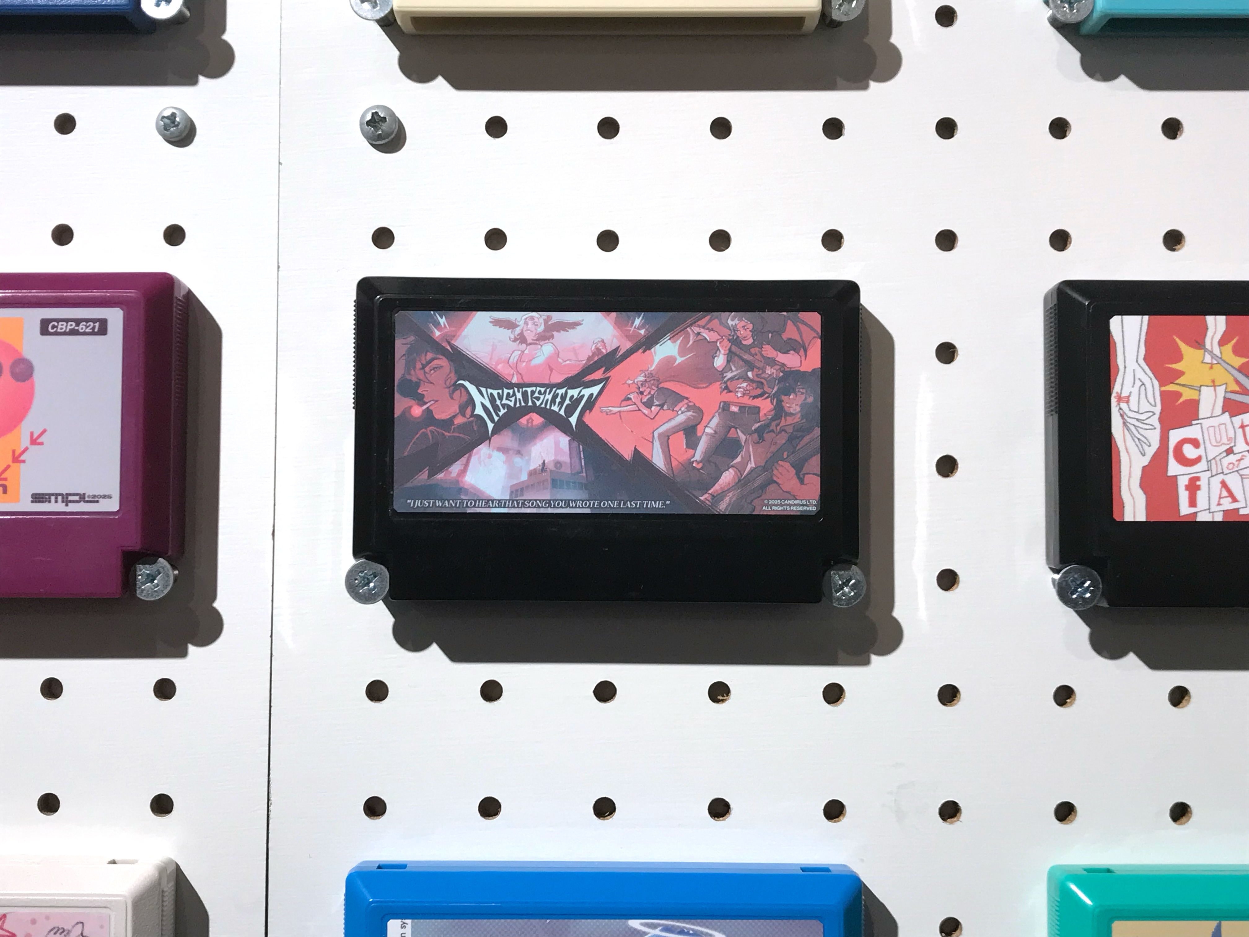
ii: my entry (no.219)
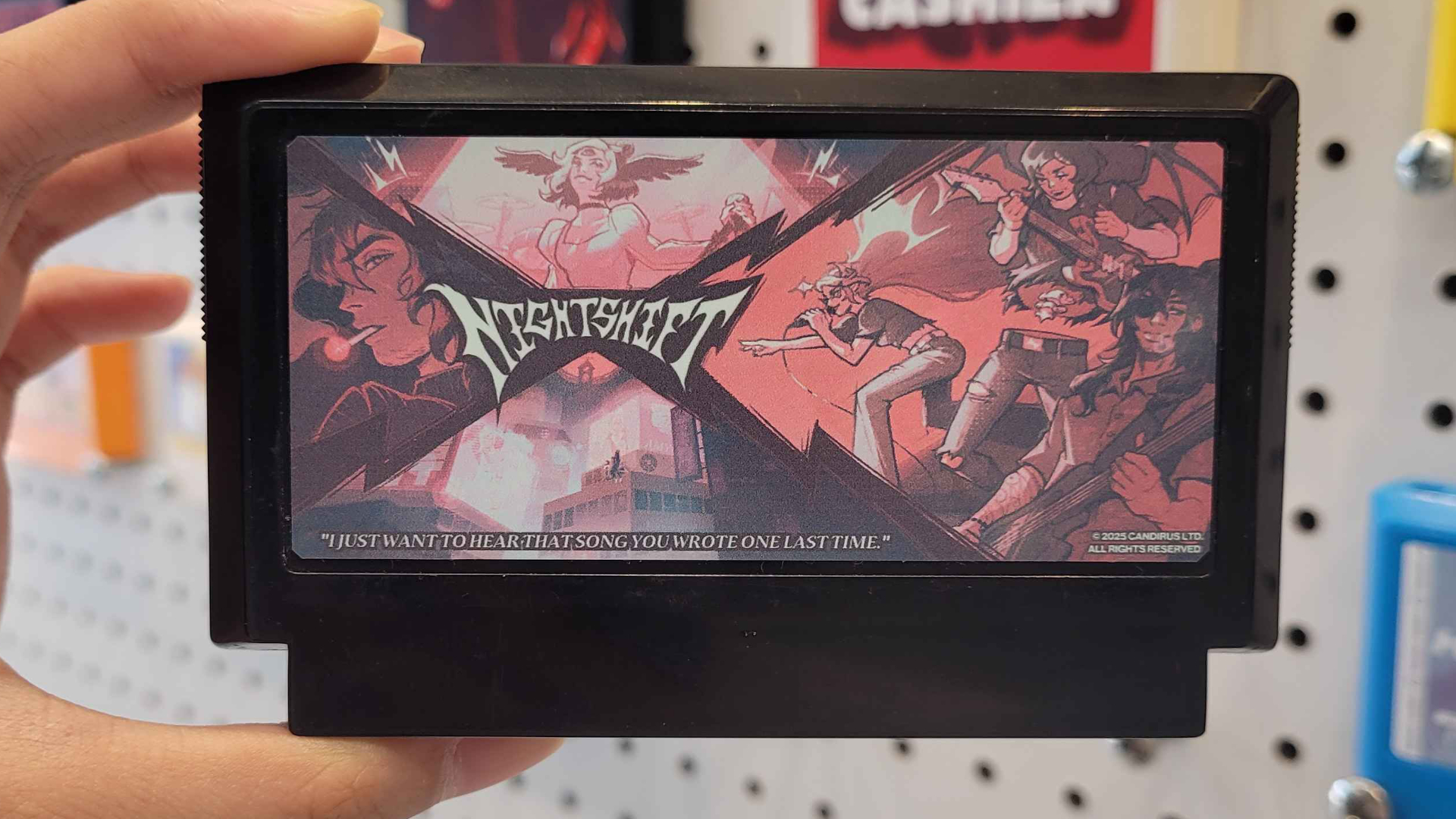
First off, here's my entry with the description I submitted: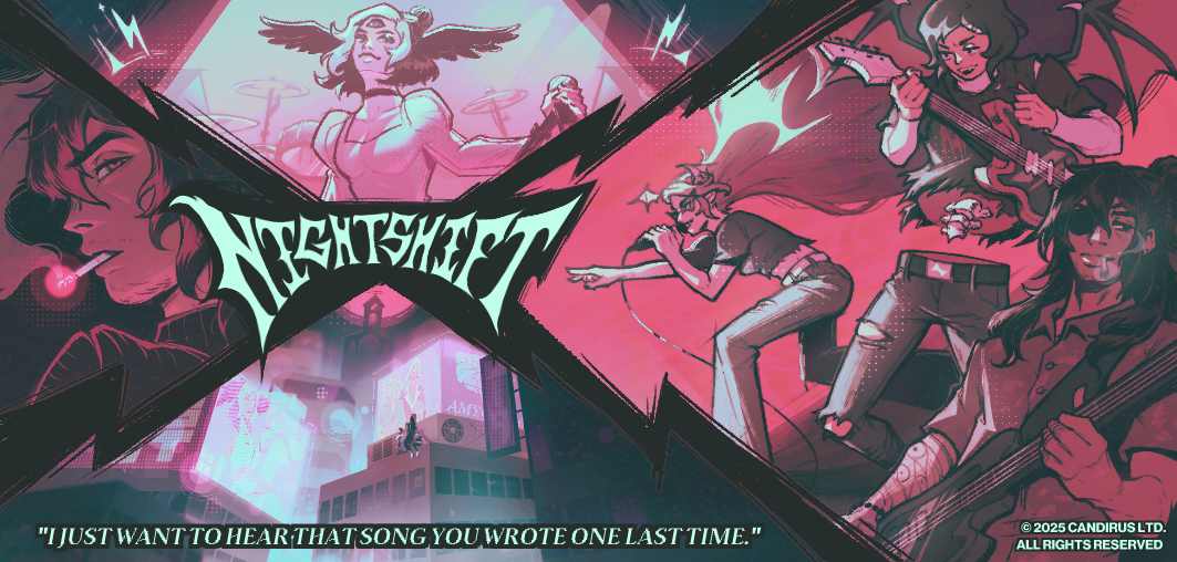
A band of vampires & the tangled connections from their past lives take final stage at Neo Angeles' battle of the bands. NIGHTSHIFT is a story-driven rhythm game about desperately clinging onto nostalgic memories, past lovers, and dead dreams.I'm not a writer, but I kinda ate with that...considering I don't really have an overarching story outline for these characters lol. Also a cute little fun fact: you can also read the description when you flip the cartridge to view the back when you're at the exhibition !
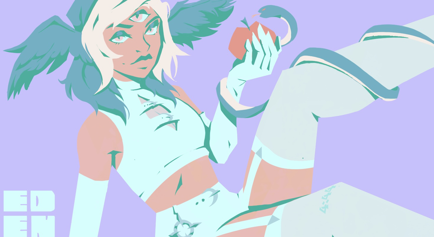
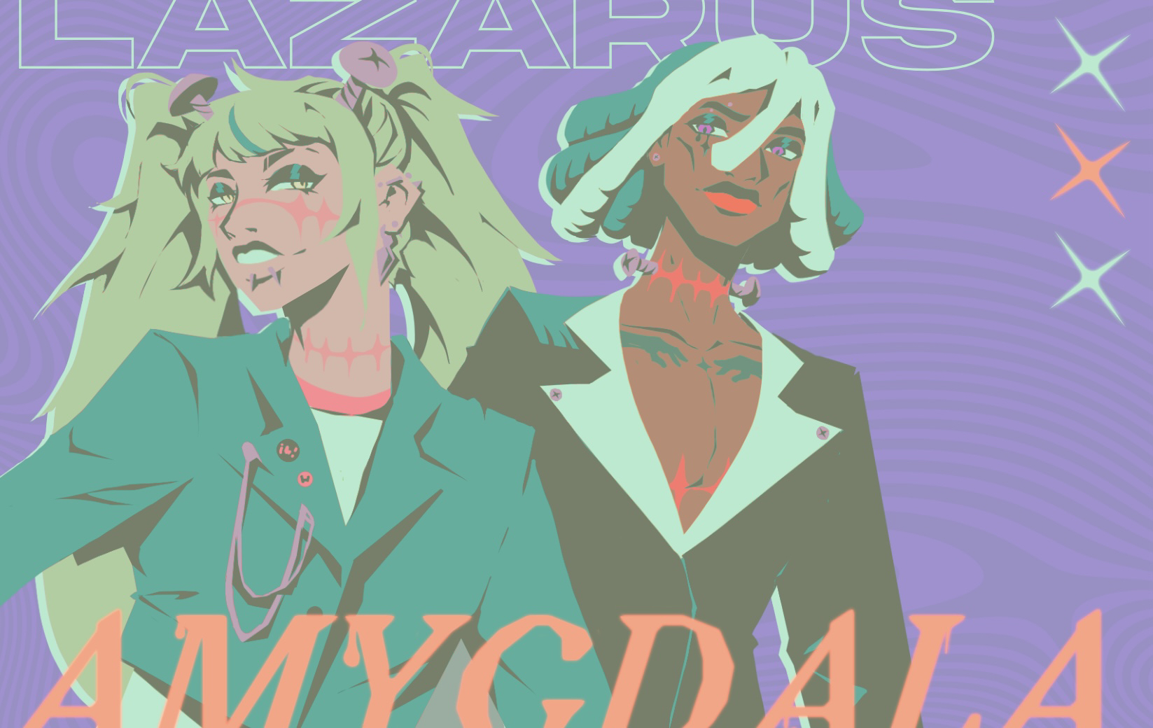
Anyways, this piece features my OCs - primarily the band members for Malikmata - Ami (vox + drums), Carrion (guitar), & Tocino (bass).There's also some glimpses of Sera (lead vox, guitar) for Angelshot & Vivi (Vocals + Keys) +Laz (Guitar) for Amygdala if you squint too.
Again, I'm incredibly excited and honored to get to be a part of this exhibition after years of psyching myself out of it & hence missing the deadline... This was definitely one of my bucket list exhibitions and I am beyond humbled to be a part of this year’s!
iii: process works
thumbnails
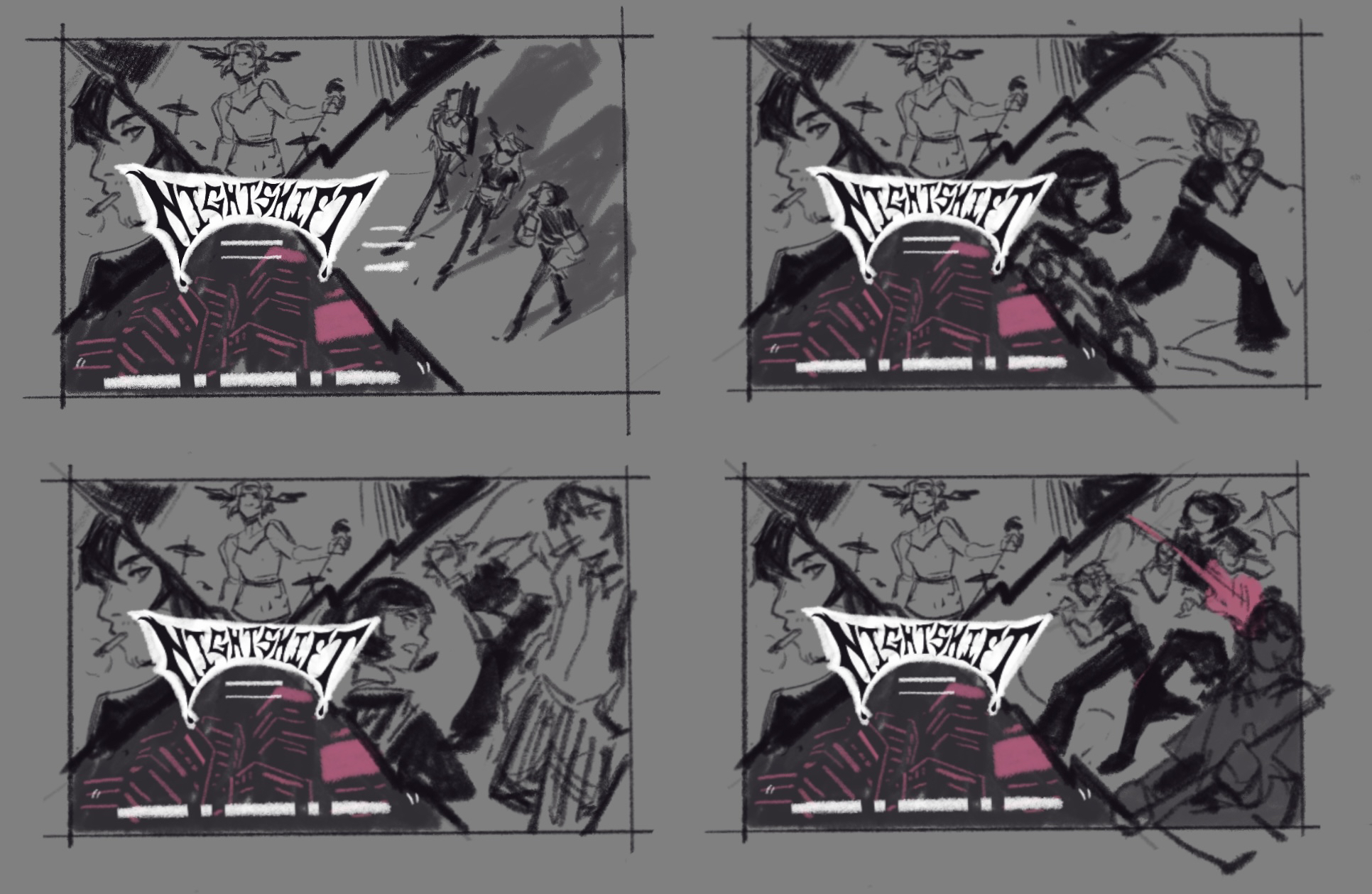
Can you tell which thumbnail was inspired while I was playing through Metaphor Re:Fantazio at the time? lol
I knew for sure I wanted to feature these OCs (I’ve been sooo focused on Astrodyne recently, I felt bad - as if I was neglecting these guys). I was struggling to come up with a dynamic composition, but I eventually settled on this X-shaped composition since I never really created a piece like that before. I wanted to include more characters, but at the time I felt like I needed to flesh out the cast's designs more before I committed to an illustration.
In hindsight, I like all the thumbnails, but I’m glad I landed on the bottom right one. To this day, I'm in love the visual of Ami reaching out towards the center of the composition while Tocino and and Carrion add some dynamic elements to the image.
sketch + color blocking
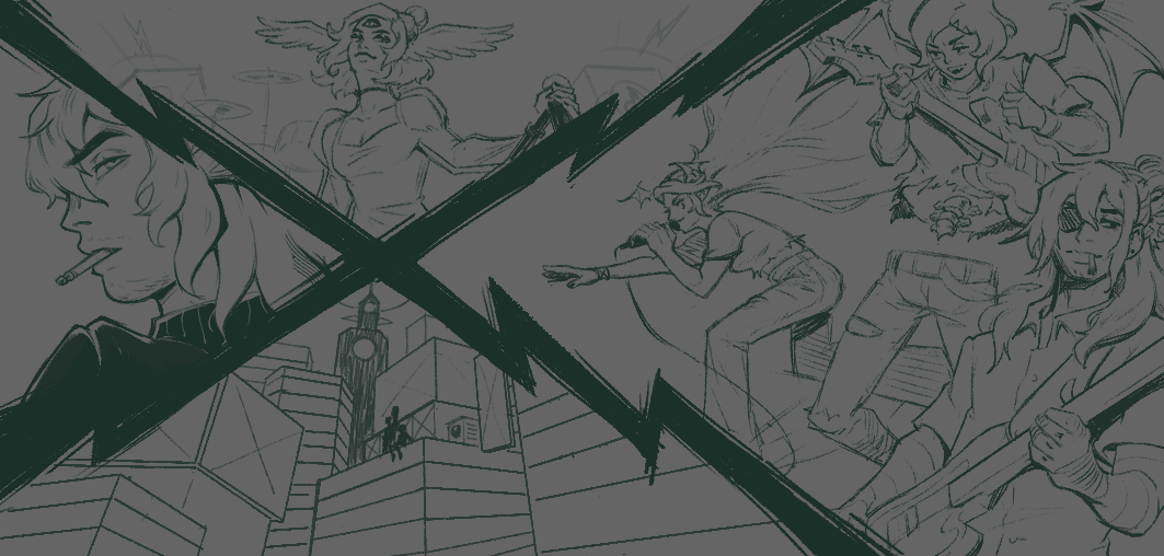
Honestly, the thumbnail sketch was so solid that I didn't struggle too much with cleaning up the sketch and working on lineart. I was in a phase where I was skipping out on lineart, since I felt like I relied on it as a crutch for so long since I hated rendering shadows. But honestly, I'm glad I nailed it and I think it's fitting especially on the left panel featuring Tocino.
I don't know why, but lately I've been drawn towards using a very dark turquoise or brown as a substitution for my darkest value. I also can't imagine any piece involving my Malikmata OCs without any warm red/pink hues or earthy neutrals in it. In a similar vein, I can’t imagine Angelshot pieces without a light blue/purple hue or any Amygdala ones without any green hue.
background
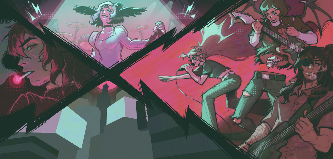
I love this bottom section in theory, but not quite in execution. I think I overblew the bloom & glowy lights, so all the values & detail work I did get butchered. This is probably the weakest part of the piece, but I like it in earlier stages of the process. The background probably should’ve either been simplified in its values or became its own separate background painting.
It's a shame because I loved implementing these billboard inspired simple paintings, but it ended up being hard to notice in the final piece.
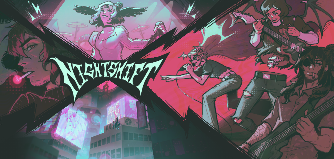
Lowkey, I think this probably was the peak version for implementing the city background. I kind of wish I didn’t overpolish and instead just kept it this way, besides making adjustments so the title could be larger. I guess this critique leads well into the next section.
iv: mini-post mortem
Although I'm satisfied with my entry besides a couple of nitpicks, I think I want the title to be waaay more prominent and striking in the overall design. After viewing my cartridge IRL, I want to make adjustments so the title takes up more visual space and is legible from further away.
My favorite entries from other artists tended to be simpler overall in terms of the number of components and complexity, but were striking in title & design. I strive towards simple, yet highly effective and stylish design as a maximalist at heart. Here are a couple of my favorites with a link to their Instagram handles if they were linked.
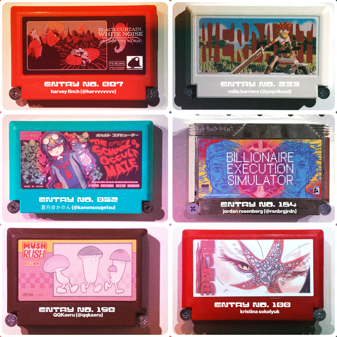
Harvey Finch ✦ Milia Barriere ✦ 蒼月@かのん ✦ Jordan Rosenberg ✦ QQ Kaeru ✦ Kristina Sokolyuk
v: end
thanks and shoutout to my younger sibling for coming with me to the exhibition and taking good quality photos for my sentimentality. we also watched weaposn that day. insane day.
Again, if you’re in the Los Angeles area, swing by &&Gallery during their hours for the remainder of August to view this year’s My Famicase Exhibition. They also carry some copies of the History of Famicase zines & a catalog of this year's entries that you can buy! The gallery’s based in the heart of K-Town, so seeing the exhibition and then grabbing some AYCE KBBQ or a lighter treat like Mochinut across the street or Bingsu a few blocks away sounds like a nice end of summer vibe~
My Famicase is definitely an exhibition I want to try and consistently be a part of. ( And one day if I ever get to visit Japan during Golden Week, I want to eventually see the exhibit in person…. )
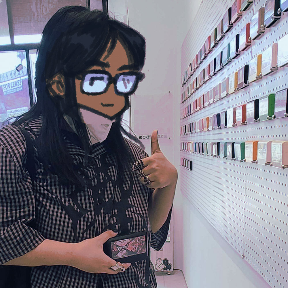
a picture of yours truly at the exhibition. i'm not photogenetic, but the fit was fire. trust me.
well anyways, that's all from me for now. i return to the cycle of delicately balancing locking in at the wage cage, making art, and surviving in this hellscape of 2025. as always, take care and be well.
- janel
i n t r o
janel.
they/them || ♑︎ || filipino
illustration and visdev.
loves their original characters, cooking, brutalist design, and halo halo
interested in creating works exploring the euphoria, humor, and devastation of the mundane -- whether it centers man, monster, or in between.